What to Consider From a Responsive Web Design?
Are you thinking of investing in a website for your business and assume everything is set for future? If this is the case, then you should think over it again.
Having a regular website is not really the best solution. As you know, today mobiles & tablets can be seen in the hands of almost everyone. Instead of a desktop computer, people love to have a smartphone. And the size of mobile phones & tablets keep changing, like landscape & portrait mode- a website need to be scale accurately on different devices.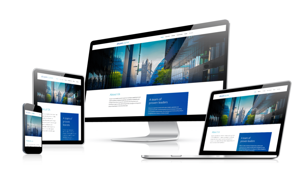
There is only one effective solution for this: Responsive website designing
With such a lot of screen sizes choices, how to get your website adjustable to all of those?
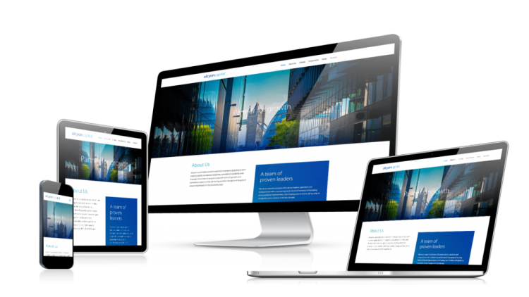
Responsive web designing
Responsive designing lets websites lithely become accustomed according to a wide range of screen sizes. A responsive design makes a website adapt across different devices which are used to browse through the web, such as tablets, mobile phones and laptops. Before getting involved deep into this topic, let’s discuss something about a responsive website:
How to check whether a website is responsive or not?
Thinking to check a website whether it is responsive or not, simply resize your browser window and you will notice that all available content scale down or up based on the size of your device window.
Basically, a Responsive site can be viewed on any device like tablet, smartphone or desktop and perfectly make use of the size of different device’s screens. Your device’s size does not matter whether it is large or small, the content will be optimized for appropriate screen resolutions. This successfully eradicates superfluous scrolling, resizing and panning while accessing a required website using different devices. Flexible layouts are something that makes such things possible for developers. Formerly which was hard to implement on a website, nowadays it is quite easier to do so. Have you ever been in a situation when you tried to include an image on a website and it has broken your site’s design? This was a case in the past. Right now, added pictures get automatically adjusted, clearing up a route for responsive web designing.
Benefits of a responsive design—
Most of the studies have shown that mobile phones overtook the market of laptop and desktops.
Reduces developing work- They don’t need to handle different versions of content for mobile and desktop website. Simply design once and it will work everywhere.
Saving money as well as time- Since a website is going to be developed just once so, people have an opportunity to save both money and time.
No need of redirects- Server-Side redirects to let desktop and mobile users access the required website. As redirects need expertise and difficult to do in server software configuration.
Consider a situation that you are going to pay your electricity bill through an online site, on your laptop. And due to certain issues, you are not able to complete the transaction. Later you go outside and suddenly you remember that you have to make bill payment. You get your phone to open that particular website on your phone but the fields that you need to fill are too small in size to see. Seriously, you will get irritated. Only a responsive web design can resolve this issue.
Hope you will like this blog! And don’t forget to share your comments below.